Hi everyone and welcome to MathSux! Today we will be looking at the difference between Bar Graphs and Histograms. Bar Graphs are something we are already familiar with but now we have histograms, a type of graph that looks somewhat similar. How and why are we using histograms? All questions will be answered in this post! Don’t forget to check your skills with the video and practice questions below. Thanks for stopping by and happy calculating! 🙂
What is the difference between Bar Graphs and Histograms?
Both a bar graph and a histogram allow us to easily visualize a data set that would otherwise just look like a bunch of numbers. By using a bar graph or histogram, we can more easily look at data, analyze it, and even come to conclusions and make decisions which why they are so useful! Nothing like a good graph to make cloudy data seem crystal clear!
Below we will look at the same exact data represented in bar graph form and in histogram form. At a quick glance, what similarities and differences do you notice? Read on for more!
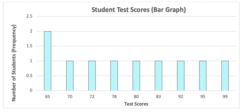
Bar Graph: Simple and to the point, bar graphs measure out the number of times something occurs. Best used for small groups of data, also, note that each bar on the graph has spaces between.
Ex:
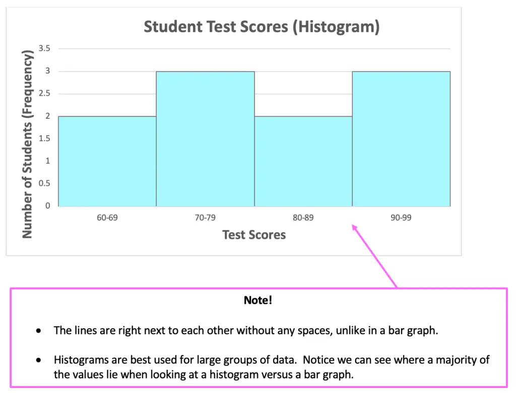
Histogram: Numerical data gets grouped together in something called a frequency table. The data is then graphed based on the number of times something occurs within that interval. Best used for larger groups of data, also note that each interval is represented with bars without spaces in between them.
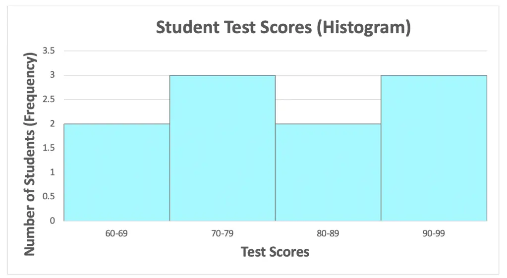
Ex: *The example below shows the same exact data shown in the bar graph above, but now in the format of a histogram.
Now, let’s check out an Example to see how to make a histogram step by step:
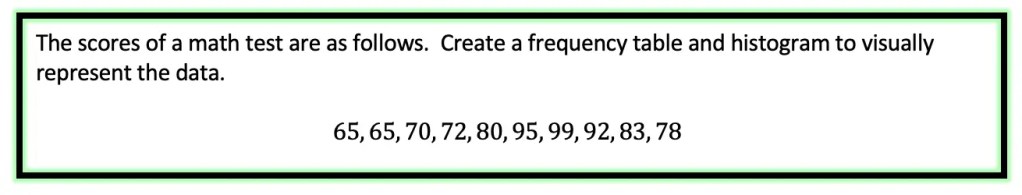
Step 1: First, we need to create something called a Frequency Table where we will create intervals of all the test scores, then tally each score given within the data set.
65, 65, 70, 72, 80, 95, 99, 92, 83, 78
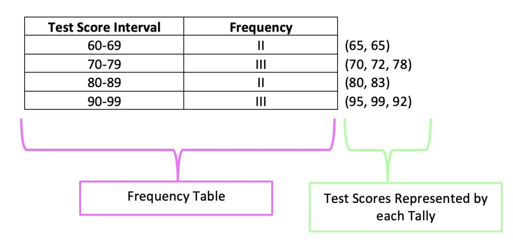
Step 2: Now we can start creating our graph with the frequency on the y-axis and the test score intervals on the x-axis. Noticed that we also gave the histogram a title.
When you’re ready, check out the questions below to practice your histogram skills!
Practice Questions:
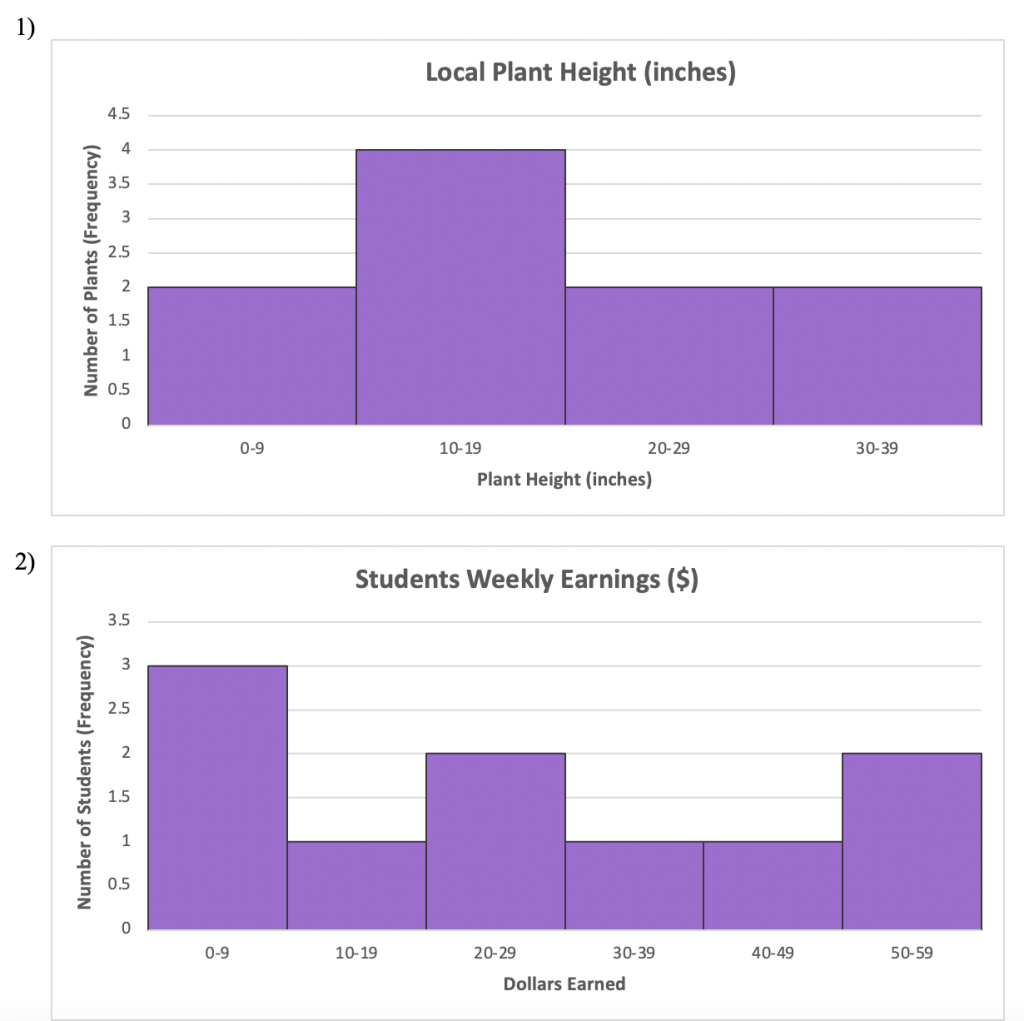
1) The science club is measuring the length of different local plants in inches and gather the following data. Create a histogram that represents their findings.
10, 12, 7, 24, 36, 8, 14, 24, 18, 30
2) A class survey is taken to find out how much students earn every week from small jobs and chores. Create a histogram for the following data that was collected:
$0, $0, $0, $15, $20, $50, $47, $25, $30, $52
Solutions:
Still got questions? No problem! Don’t hesitate to comment with any questions or check out the video above. Happy calculating! 🙂
Facebook ~ Twitter ~ TikTok ~ Youtube
Looking for more? Check out this post on Box and Whisker Plots and the MathSux Statistics page here!
3 thoughts on “Difference between Bar Graphs and Histograms”