Ahoy math friends! This post takes a look at one method of analyzing data; box and whisker plots. Box and whisker plots are great for visually identifying outliers and the overall spread of numbers in a data set. We will go over step by step how to create a box and whisker plot given a set of data, we will then look at how to find the interquartile range and upper and lower outliers. If you have any questions, don’t hesitate to check out the video or comment below. Stay curious and happy calculating! 🙂
Looking for more MathSux? Check out this post on variance and standard deviation here!
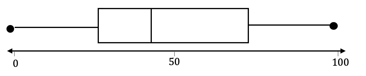
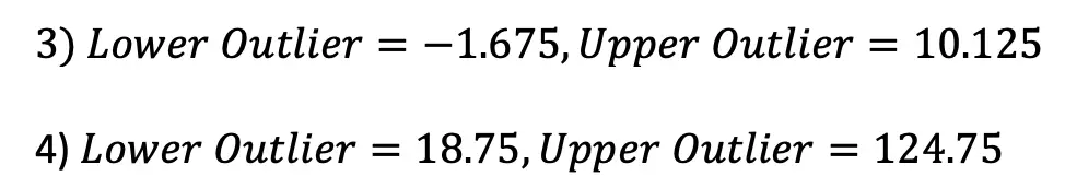
Box plots look something like this:
Why Box Plots?
Box Plots are a great way to visually see the distribution of a set of data. For example, if we wanted to visualize the wide range of temperatures found in a day in NYC, we would get all of our data (temperatures for the day), and once a box plot was made, we could easily identify the highest and lowest temperatures in relation to its median (median: aka middle number).
From looking at a Box Plot we can also quickly find the Interquartile Range and upper and lower Outliers. Don’t worry, we’ll go over each of these later, but first, let’s construct our Box Plot!

-> First, we want to put all of our temperatures in order from smallest to largest.
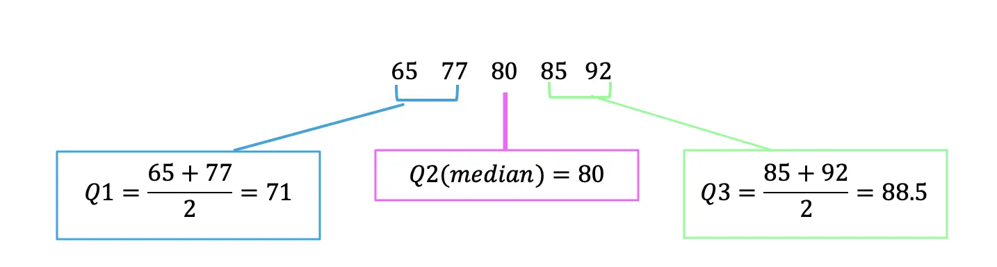
-> Now we can find Quartile 1 (Q1), Quartile 2 (Q2) (which is also the median), and Quartile 3 (Q3). We do this by splitting the data into sections and finding the middle value of each section.
Q1=Median of first half of data
Q2=Median of entire data set
Q3=Median of second half of data
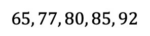
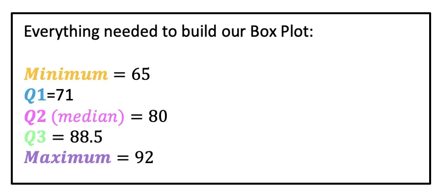
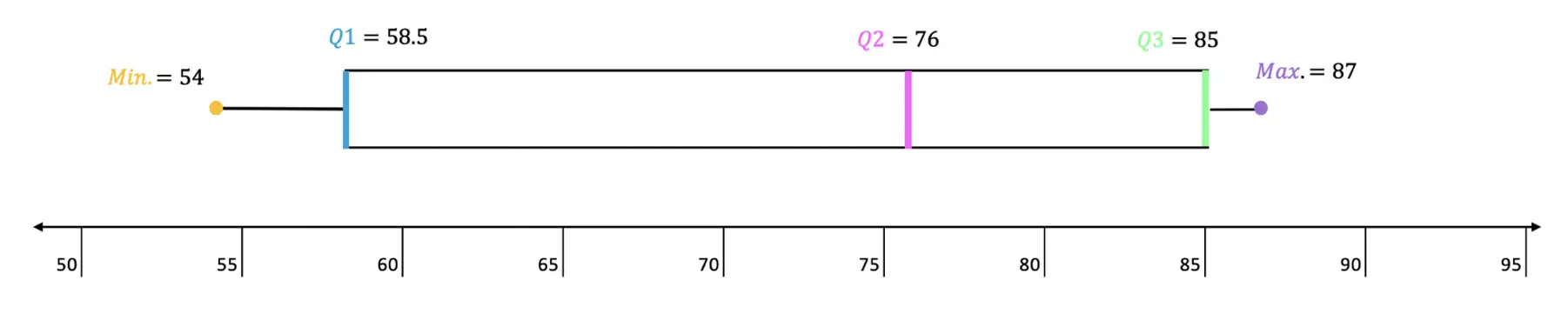
-> Now that we have all of our quartiles, we can make our Box Plot! Something we also have to take notice of, is the minimum and maximum values of our data, which are 65 and 92 respectively. Let’s lay out all of our data below and then build our box plot:
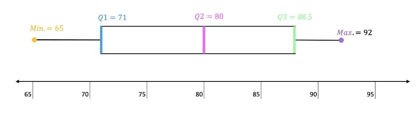
Now that we have our Box Plot, we can easily find the Interquartile Range and upper/lower Outliers.
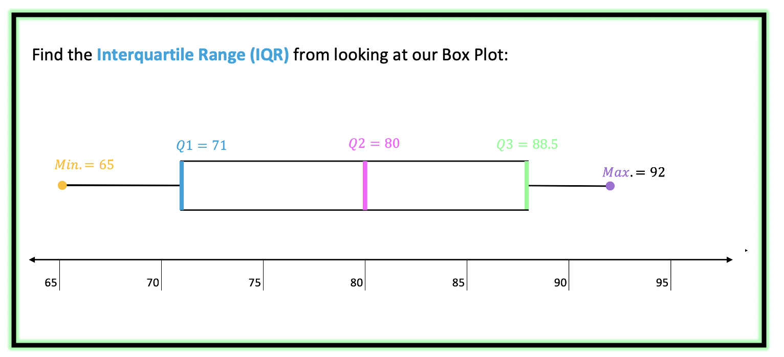
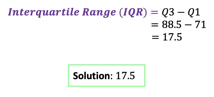
->The Interquartile Range is the difference between Q3 and Q1. Since we know both of these values, this should be easy!
Next, we calculate the upper/lower Outliers.
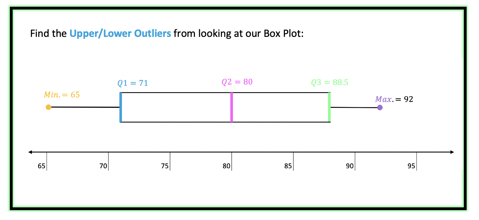
-> The Upper/Lower Outliers are extreme data points that can skew the data affecting the distribution and our impression of the numbers. To see if there are any outliers in our data we use the following formulas for extreme data points below and above the central data points.
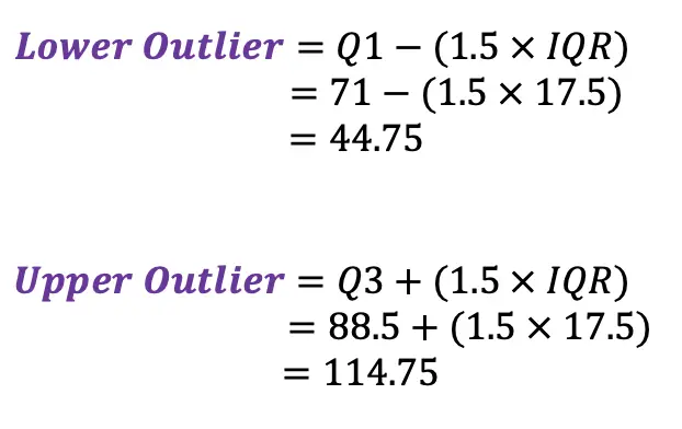
*These numbers tell us if there are any data points below 44.75 or above 114.75, these temperatures would be considered outliers, ultimately skewing our data. For example, if we had a temperature of ![]() or
or ![]() these would both be considered outliers.
these would both be considered outliers.

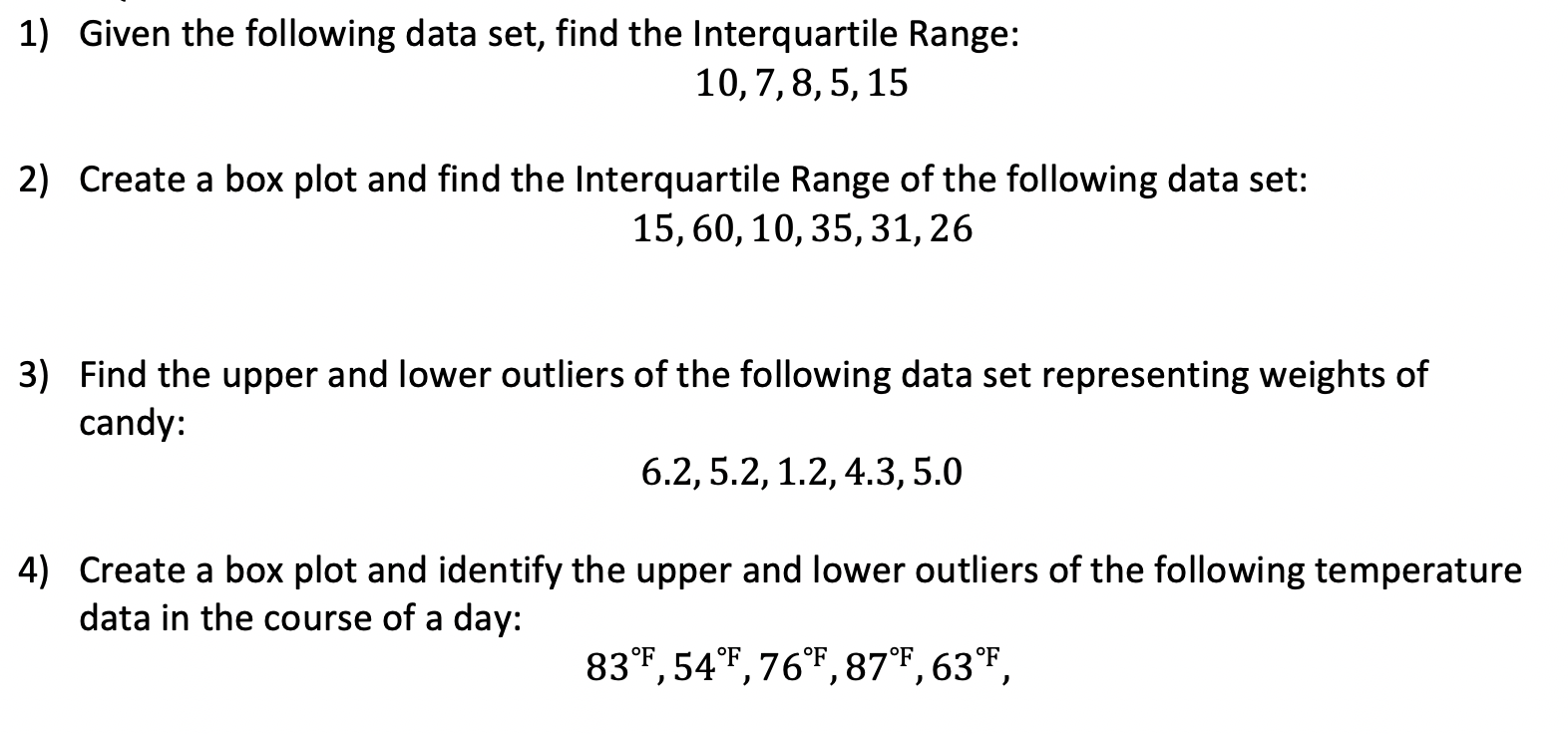
Practice Questions:
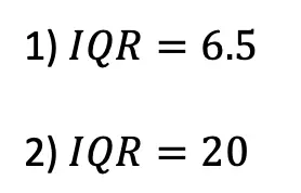
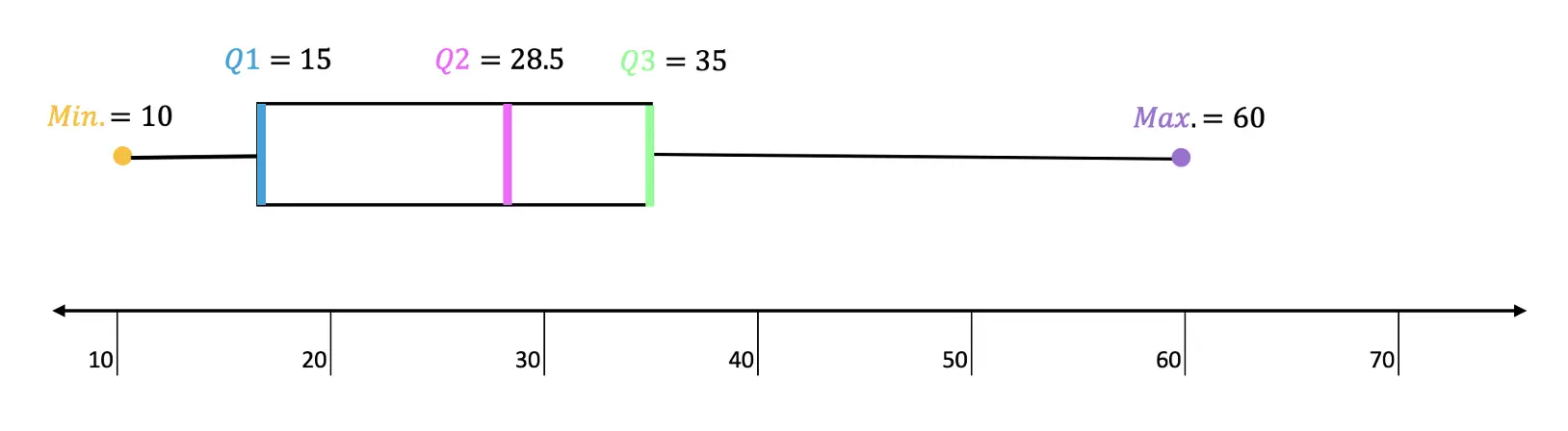
Solutions:
Still got questions? No problem! Don’t hesitate to comment with any questions or check out the video above. Happy calculating! 🙂
Facebook ~ Twitter ~ TikTok ~ Youtube
How to make other Graphs?
Looking to learn about different types of graphs to represent data differently? Check out the difference between Bar Graphs and Histograms here!
2 thoughts on “Box and Whisker Plots, IQR and Outliers: Statistics”